Are your data visuals designed to explore or explain?
Picture the scene: we’ve gone digging in some data, thrown it into some charts and found a killer insight. Eager to share, we screenshot that chart, paste it onto a slide with some annotations and a snappy title, ready to wow colleagues. But here’s the rub - when we put it up on screen we notice the audience aren’t nodding along enthusiastically, like we’d hoped, but instead they’re squinting and tilting their heads, trying to figure out this dense and overcomplicated chart we’ve put before them.
We may have just served up an exploratory chart thinking it was explanatory.
I’ve been on both sides of that scenario, and it’s what led me to a real eureka moment some years ago when I realised there were two quite different purposes for visualising data.
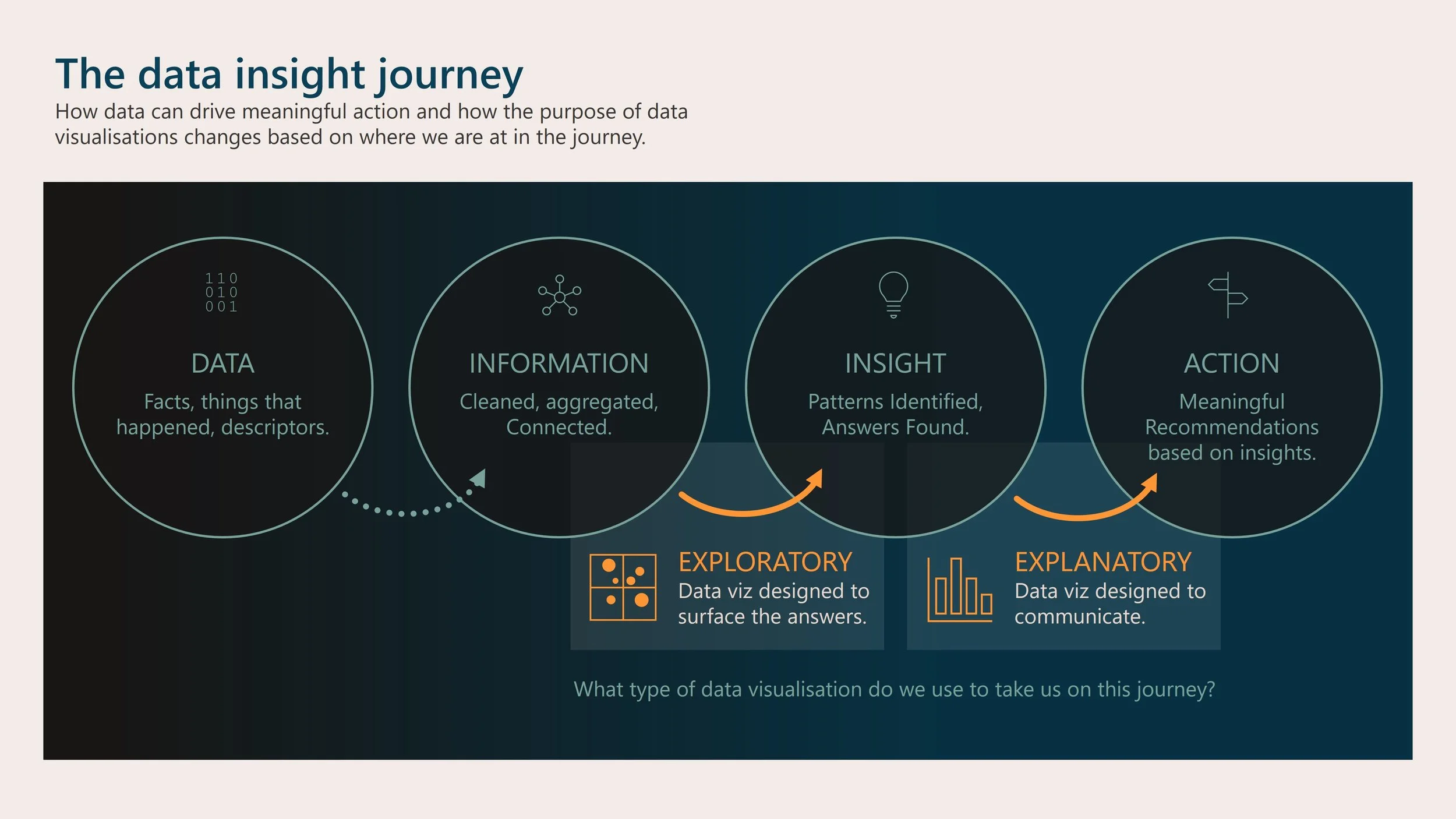
The data → insight journey
To provide a bit of context, let’s think about the data insight journey, and how our data makes its way from a collection of raw facts through to meaningful action.
Raw data - our data starts out as a collection of facts, things that happened, descriptive attributes and so on.
Information - data that has been cleaned, structured, aggregated and connected, we’ve set up links to useful context and benchmarks, and it’s ready for us to ask questions of it.
Insight - we’ve found evidence in the data that provides answers to our meaningful questions.
Action - the answer to our question becomes a call to action, which is what a stakeholder is usually after. What decisions should they make and what levers to pull?
To turn information into insight we use exploratory visuals
When we are looking for answers in the data, aiming to turn information into insight, that’s when our visuals have an exploratory purpose.
At this point we’re creating visualisations for ourselves, so they don’t need to be focused, and we may need to include different dimensions (multiple series, secondary axes etc) to ensure we’ve covered all relevant angles.
As the creator, I’ve had plenty of time to become familiar with the visual, the metrics, the context, and to play around with options and filters. As the metaphorical data detective, I’d be fine with a load of charts pinned to a cork board with red strings connecting them. I can cope with a fair amount of clutter and complexity because I know what can be ignored.
Our audience often won’t have that luxury, however.
I’ll try to illustrate what I mean by an exploratory visual by sharing a personal favourite.
Distribution of English letters, an example of an exploratory visual
I love this small multiples chart of the distribution of letters in the English language, compiled by David Taylor.
It doesn’t make a statement about anything specific but really invites you to explore it, to pick a letter and see where it’s most likely to fall in a word. Then pick another.
You’ll notice it shows multiple dimensions, with the colour encoding the overall frequency, the shape of the area encoding relative position within the word.
Every time I look at it, I find a different insight.
Explanatory visuals help drive action from insight
Once we’ve found our answer, the purpose of the visual is no longer about seeking insights and patterns, but instead is about communicating clearly to our audience.
This is when we employ a more explanatory (or declarative) visual. It should be focused, uncluttered, and designed so that the reader’s eye is immediately drawn to what is important and what to take away from it.
Fewer children are dying, an example of an explanatory visual
I could have used dozens of examples from the fantastic site Beautiful News, by David McCandless, but I’ll settle on this one about the reduction in child mortality over time.
It really focuses on its powerful message – using a single metric and a single series. Sure there could have been extra context and background data, but that would just distract from the succinct message.
In summary
In this short article, I hope I’ve opened your eyes to this important aspect of data visuals – that of the exploratory versus explanatory purpose, and how we should be mindful of that when building our data communications.
If that’s whet your appetite, then you may want to speak to us about information design, schedule some data viz training, or you can subscribe to be notified when we post future articles on topics like these.


